Vue Components
The following components are only available when useComponent is set to true in nuxt.config.js.
This module uses the official Vue components built for Cloudinary and registers the following components for use in the application.
Each of the components below is embedded with delivery URL building mechanism of Cloudinary.
If you encounter issue during install Cloudinary module because of the version of cloudinary-vue, please delete your npm-modules folder, re-install cloudinary-vue@1.1.2 (or newer version) and then re-install @nuxtjs/cloudinary.
Media components
For CldImage, CldVideo, CldPoster and CldContext, you can set a different cloud name using cloudName prop and serve asset from that cloud instead of the default one.
CldImage
Props:
publicId:required- Type:
String
- All other Cloudinary configuration options and transformations such as
width,cropfor cropping type,radiusfor border radius, etc.
Outputs a <img> element with src is the generated delivery URL from Cloudinary.
<cld-image
  public-id="my-pic-id"
  width="200"
  crop="scale"
  radius="max"
  fetchFormat="auto"
  quality="auto"
  loading="lazy"
/>
Result will be:
<img src="https://res.cloudinary.com/my_cloud/image/upload/w_200,c_scale,r_max,f_auto,q_auto/my-pic-id" />
Any non-Cloudinary standard attributes are treated as normal HTML attributes. If publicId is an external URL and there is no type='fetch' attribute, the component just returns a normal <img> element with all attributes as HTML attributes.
You can refer more details on a full list of image transformation options
CldVideo
Props:
publicId:required- Type:
String
- All other Cloudinary configuration options and transformations such as
width,overlay,qualityfor resolution etc.
Outputs a <video> component including multiple <source> with generated URL sources for the main formats supported by browsers (webm, mp4, ogv) and a poster thumnail image.
<cld-video
  public-id="my-video-id"
  width="500"
  crop="scale"
  quality="auto"
  overlay="text:arial_60:watchme"
/>
Result will look like:
<video>
  <source src="https://res.cloudinary.com/my_cloud/video/upload/w_500,q_auto,c_scale,l_text:arial_60:watchme/my-video-id.webm" type="video/webm">
  <source src="https://res.cloudinary.com/my_cloud/video/upload/w_500,q_auto,c_scale,l_text:arial_60:watchme/my-video-id.mp4" type="video/mp4">
  <source src="https://res.cloudinary.com/my_cloud/video/upload/w_500,q_auto,c_scale,l_text:arial_60:watchme/my-video-id.ogv" type="video/ogg">
</video>
Any non-Cloudinary standard attributes are treated as normal HTML attributes.
You can refer more details on a full list of video transformation options
Supportive components
CldPlaceholder
This component can only be used as a child component for CldImage component
Props:
type:- Type:
String - Default:
blur - Accepted values:
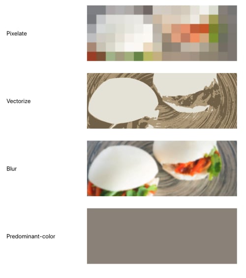
blur,vectorize,pixelate,predominant-color
- Type:
Provides a fast and lightweight image version of a target image (defined in its parent element - CldImage) and displays it as the placeholder untill the target image finishes downloading.
Example: To set a pixelate placeholder for a CldImage component
<cld-image public-id="my-pic-id">
  <cld-placeholder type="vectorize" />
</cld-image>
Result will be similar to the following:

Below is how each placeholder type looks:
CldPoster
This component can only be used as a child component for CldVideo component.
Props:
publicId:required- Type:
String
- All other Cloudinary configuration options and transformations such as
width,cropfor cropping type,radiusfor border radius, etc.
Specify an image to use as poster for a CldVideo component.
<cld-video publicId="my-video-id" overlay="text:arial_60:watchme">
  <cld-poster
    public-id="video-poster"
    width="500"
    crop="scale"
    quality="auto"
  />
</cld-video>
Result
<video poster="https://res.cloudinary.com/my_cloud/image/upload/w_500,c_scale,q_auto/video-poster">
  <!--All the sources-->
</video>
CldContext
This component needs to be used as a wrapping component for CldImage, CldPoster or CldVideo component.
Define additional shared Cloudinary configuration and transformation options to apply to all of its children components which are Cloudinary-related.
<cld-context
  cloud-name="my-other-cloudname"
  fetchFormat="auto"
  quality="auto"
  loading="lazy"
>
  <cld-image public-id="my-pic-id" width="200" crop="scale" radius="max" />
  <cld-image public-id="my-other-pic-id" width="500" crop="thumb" height="500" />
</cld-context>
CldTransformation
This component needs to be used as a nested component of CldImage, CldPoster or CldVideo component.
Define additional transformations such as width, crop for cropping type, radius for border radius, etc to apply on its parent Cloudinary component (except CldContext). Useful for grouping transformations
<cld-image public-id="my-pic-id">
  <cld-transformation width="200" crop="scale" radius="max" />
  <cld-transformation fetchFormat="auto" quality="auto" loading="lazy" />
</cld-image>
You can use transformation attribute in CldImage which receives an Array of Object for transformation options as alternative for this component.
You can explore a basic example, or refer the official documentation for more advanced use cases.